Comments on economics, mystery fiction, drama, and art.

Thursday, May 30, 2013

Generating the Wealth of Nations 27: Brazil and Colombia

When I finished my discussion of Argentina, Brazil, Chile, and Mexico. I noticed that Brazil and Columbia began the 20th century with nearly identical real GDP per capita...and wound up, in 2010, with nearly identical real GDP per capita.  The paths aren't all that different, either (Colombia grew a little faster early, and Brazil grew a little faster later).  If anyone is more familiar with what has been happening in these two countries than I am (that would include almost everyone, I would guess), have at it.

(Click to enlarge.)

Data from the Maddison Project.

Generating the Wealth of Nations 26: Disruption, Catch-up, and Convergence in Four Latin American Countries

The European and Japanese experience does seem to display catch-up after disruptions and convergence toward the US.  That experience does not seem to be as fully represented int he four largest Latin American economies--Argentina, Brazil, Chile, and Mexico.

 Argentina, which started the 20th century as one of the richest countries in the world (as did Chile, for that matter), has been one of relative stagnation and regress.  There is little evidence of strong periods of catch-up growth following disruptions, and none of convergence.  Had the Argentine economy grown at its pre-World War I trend throughout the 20th century, real GDP per capita there would have reached the equivalent of just over $20,000 per year--roughly on a par with France or Germany.  Instead, it had reached only $7,770 by 2010.  World War I apparently disrupted Argentina's economy more severely than it did the economies of Brazil, Chile, and Mexico, more probably because of Argentina's close economic ties to Germany (and the relatively successful Allied blockade of Germany).  Real Gdp per capita had not returned to its trend growth level by the beginning of the Depression, and, indeed, growth has only rarely reached that per-WW1 trend since.

(Click to enlarge.)

Brazil, which was a much poorer country than Argentina, Chile, or Mexico in 1900 (real GDP per capita of only $678--half of Mexico's and a third of that in Argentina or in Chile) experienced little disruption from the Depression or from WWII, and continued to grow at roughly the same trend rate for the entire 1900-1955 period (about 1.8% per year).  By 1955, real GDP per capita had reached only about $2,000--roughly the level in Argentina and Chile in 1900, and only half the US level in 1900.  Since then, real GDP per capita has more than tripled, reaching nearly $7,000 in 2010.  But that does represent remarkable convergence with the US.  Brazil's real GDP per Capita was 17.5% of the US level in 1955 (it had been 16.7% of the US level in 1900); by 2010, it had grown to 22.6% of the US level.  Brazil has avoided any significant disruption to its growth, but it also did not begin to converge toward the level of income in more developed nations until quite recently.


 (Click to enlarge.)

Chile has also not followed the disruption--catch-up pattern.  Chile was, as I noted above, a more-or-less "rich" country in 1900.  However, its trend growth to 1929 was well below that in the US (1.58% per year compared with 2.02% er year in the US).  Chile was suffered significant disruption from the Great Depression, with real GDP per capita falling about 35% from 1929 to 1933 (for comparison, real GDP per capita fell by 30% in the US, 17% in Argentina, 5% in Brazil, and 15% in Mexico--and actually growing by 5% in Colombia).  Growth returned to its earlier trend rate by about 1936, but Chile did not catch back up to where it would have been in the absence of the disruption of the Depression for a long time.  Indeed, the economy experienced two additional periods of disruption, from 1970 to 1975 (the period during which Salvador Allende was elected president and then deposed in a military coup) and from 1981 to 1983.  In 1983, real GDP per capita in Chile was only 20% above its 1900 level.  But then the economy began to take off, with real GDP per capita growing by 188% in the ensuing 27 years (by contrast, growth in the US was only 60% over that period).  So there was, eventually, the beginning of convergence.

 (Click to enlarge)

In Mexico, where real GDP per capita was less than 1/3 of that in the US in 1900 (and about half that in Argentina or Chile--but double that in Brazil), we finally see the same pattern as in Europe--disruption associated with the Great Depression (but not World War II), catch-up from the bottom of the Depression in 1933 until 1965 (when Mexico returned to the level of real GDP per capita it would have attained had it remained on its pre-Depression path) and convergence until 1981.  Since then, however, the Mexican economy has grown somewhat fitfully, with one major (1981-1988) and three minor (1994-1995; 2000-2003; 2007-2009) downturns.  By 2010, real GDP per capita in Mexico was just about where it would have been had the Mexican economy grown at its pre-Depression rate steadily since 1900.  As a result, real GDP per capita in Mexico, what had been about 1/3 that in the US in 1900, is now only about 1/4 of the US level (the ratio of Mexican real GDP per capita to US real GDP per capita peaked in 1981 at about 36%); real GDP per capita in Mexico has grown by only 15% in the 1981-2010 period.

(Click to enlarge,)

All data from the Maddison Project.

Generating the Wealth of Nations 25: Disruption, Catch-Up, and Convergence in Europe--and Japan

Following on to the discussion in Lecture 6 on disruption, catch-up growth, and convergence, I have looked at three major European countries--the United Kingdom, France, and Germany--and in Japan.  However, instead of looking at real GDP, I looked at real GDP per capita.  In each chart, the black line is the actual path of real GDP per capita in the country and the green line is the trend of real GDP per capita (usually, but not always, based on the 1900-1929 period.

Looking first at the UK, I used the 1900-1920 period to identify a trend, because of the disruption to the UK economy caused by attempting to return to the gold standard.   That disruption was followed fairly quickly by the Great Depression, and the UK did not return to its 1920 level of real GDP per capita until roughly 1933 (by going off the gold standard quickly, the UK had begun its recovery from the Depression more quickly as well).  real GDP per capita did not return to its trend level until 1940.  And World War II represented another disruption, with the return to trend not occurring until about 1960.  Rapid growth in the UK actually began during the post-WW2 "catch-up" period, about 1947 or 1948, and growth exceeded the early 20th century trend until the recent worldwide contraction (2007 and following).

(Click to enlarge.)

 France presents a similar picture, differing (of course) in the details.  Following the severe disruption of World War I (it's never good for a country's economy to have a major war fought on its own territory), the French economy caught back up to its trend by about 1927 or so...just in time for the Great Depression.  The Depression was prolonged in France by its persistence in remaining on the gold standard, and catch-up did not begin until 1935.  It was short-circuited in 1939 , with the outbreak of another major war, with major combat operations in France.  Catch-up in this case did not begin until WW2 ended, and France returned to its growtht rend level of real GDP per capita in about 1962.  Growth, however had been faster than the pre-WW1 trend since 1945, and that faster growth continued until 2007.

 (Click to enlarge.)

Germany's pre-Great Depression trend really terminates in 1913 (despite what the legend on the chart says; I forgot to correct it).  World War I was not kind to the German economy, either.  Germany's catch-up was aborted by the Great Depression and resumed about 1933--and continued into the late phases of World War II.  Real GDP per capita fell by almost 60% between 1944 and 1946, as invasion and destruction wiped out a greatedeal of Germany's productive capacity (both its physical capital and its human capital).  The post-WW2 catch-up phase was quite strong, and Germany was back to its previous peak by about 1956, and back to its old trend by 1960.  Clearly growth was much mmore rapid in this phase, and continued to be more rapid than the pre-war trend until reunification in the 1990s.

(Click to enlarge.)

Japan's economy was apparently little affected by the Great Depression (this somewhat surprised me; real GDP per capita, which fell on the order of 20% or more in the US, the UK, France, and Germany, fell by only 9%, and had returned to its trend level by 1936 or 1937).  As in Germany, real GDP per capita maintained its trend growth until late in the war, with US naval forced by 1944 essentially cutting Japan off from its pre-war and wartime suppliers.  Real GDP per capita fell by about 50% between 1944 and 1946.  Japan's growth exploded in the post-WW2 period, reaching its earlier peak by 1955 and its pre-war trend growth level by 1 958.  Its growth continued at this new more rapid trend until about 1985, and growth in Japan has been quite modest since.

(Click to enlarge.)

All data from the Maddison Project.

Tuesday, May 28, 2013

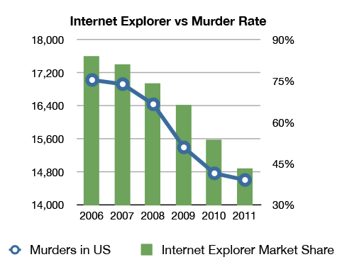
Correlation vs. Causation In a Single Graph

I had to steal this (from Chris Blattman) and post it here:

47D7zGq
So, does a decline in Internet Explorer's market share cause the murder rate to fall?
Or does a decline in the murder rate cause Internet Explorer's market shar to fall?
Or is just a coincidence?

Saturday, May 25, 2013

Generating the Wealth of Nations 24: Real GDP per Capita and a Measure of Well-Being

This really goes back to a much earlier part of the semester, when we talked about measuring economic output and the relationship between real GDP per capita and well-being.  But I thought it was interesting.

Here’s a report from Forbes, on a measure of happiness:

Quantifying happiness isn't an easy task. Researchers at the Gallup World Poll went about it by surveying thousands of respondents in 155 countries, between 2005 and 2009, in order to measure two types of well-being.

“First they asked subjects to reflect on their overall satisfaction with their lives, and ranked their answers using a "life evaluation" score from 1 to 10. Then they asked questions about how each subject had felt the previous day. Those answers allowed researchers to score their "daily experiences"--things like whether they felt well-rested, respected, free of pain and intellectually engaged. Subjects that reported high scores were considered "thriving." The percentage of thriving individuals in each country determined our rankings.”
I took their rankings and charted the relationship between real GDP per capita (in 2011) and the percent of respondents ranked as “thriving,” “struggling,” and “suffering.”  The three charts below show those relationships.  The correlations between real GDP per capita and the happiness rankings are as follows:

Correlation
Between
Real GDP
per Capita and
Percent Thriving           0.69
Percent Struggling       -0.61
Percent Suffering         -0.45

This does suggest that real GDP per capita is related to well-being; on the other hand, I’m surprised by how low the correlations are—especially the correlation between real GDP per capita and the percent of the population classified as suffering.  (The second chart should be labeled "Real GDP per Capita and the percent of People Saying They Are Struggling."  My typing error.)


(Click a chart to enlarge it.)

Thursday, May 23, 2013

Generating the Wealth of Nations 23: US Monetary Policy in the Great Depression

I found it difficult (without typing a lot of numbers into a spreadsheet) to get data on the US money supply.  However, I could find data on the US monetary base.  Many economists think there is generally a stable relationship between the base and the money supply, and, in any event, what the Federal Reserve can control (and affect) is the base.  Presumably, it adopts policies that lead to increases in the base when it wants to expand the economy and it adopts policies that slow the growth of the base--or shrink it--when it's trying to combat inflation.


(Click to enlarge.)
 
The Federal Reserve essentially did not begin to increase the base until early in 1931, about 18 months after the downturn in US industrial activity began.  And between early 1933 and the end of 1936, it expanded the base quite dramatically (at an average annual rate of 11.7%).  As Prof. Borland indicated, acting on the basis of fears of inflation (which were not really well-founded), the Fed slashed the base by nearly 20% over a little more than a year, which led to the decline in economic activity in 1937/38.
 
 
Source:  The Federal Reserve Bank of St. Louis, FRED database.


Generating the Wealth of Nations 22: Two Charts on the US and Gold

The US increased its gold holdings substantially in the 1920s, from $2.88 billion worth in 1920 to $4.47 billion in 1930.  (Keep in mind that the official price of gold was fixed during this time period, at $20.67 per ounce of gold.)  Gold holdings rose at an average annual rate of 4.5% per year.  You can see this in the first chart.  Interestingly, after almost every country in the world went off the gold standard, US holdings of gold skyrocketed, from $4.47 billion in 1930 to $19.85 billion in 1940 (the US was paying $35 per ounce for gold in this period, so we were only sort of off the gold standard).

 
(Click to enlarge.)
 
 
What's interesting, though, is that US gold holdings as a percentage of nominal GDP were roughly 5% throughout the 1920s.  In terms of how the gold standard was supposed to operate, this was probably an indication that the US was not playing by the rules.  As gold flowed into a country, its money supply was supposed to increase, which was supposed to raise its domestic price level.  This would cause imports to rise and exports to fall, and so put an end to the gold inflow.  In fact, as the final chart below shows, the price level in the US did not rise in the 1920s; the Federal Reserve and the US Treasury (mostly the Treasury, which was the custodian of the gold stock then) engaged in what was called "sterilizing" the gold inflow--not letting it lead to an increase int he money supply or in prices.  (It's worth noting that the Bank of France was even worse in this respect.)


(Click to enlarge.)

Generating the Wealth of Nations 21: Banking and Bank Failures in the US, 1915-1930

Bank failures became significant well before the onset of the Great Depression.  The number of banks in the US fell by nearly 18% from its peak (of about 31,000 banks) in 1921 to about 25,500 banks in 1929.  From 1921 through 1929, 5,664 banks in the US failed, very nearly equal to the decline in the number of banks.  Most of the bank failures were small town banks that depended on agriculture lending for their profits, and the decline in farm incomes hit them very hard.  (For comparison, the US currently has less than 9,000 commercial banks, largely due to consolidation, not banks failing.)  The following chart shows the number of banks in the Us, and the second chart shows bank failures as a % of banks. 


(Click to enlarge.)

Source: Historical Statistics of the United States from Colonial Times to 1970.

Generating the Wealth of Nations 20: Farm Income in the US in the 1920s

One sector of the US economy that did poorly during the 1920s was agriculture.  Total farm income fell throough the decade, as the chart below shows.

(Click to enlarge.)

Source: Historical Statistics of the United States from Colonial Times to 1970.


Generating the Wealth of Nations 19: US Exports and Imports During World War 1

One of the ways in which the US derived an economic benefit from World War 1 was from an export boom, which is clearly visible in the following chart.  This export boom was largely financed by US bank lending to importers, and the largest growth in US exports was to England (and, secondarily, to France).  While US imports held relatively steady as a  percent of GDP, the source of imports into the US shifted away from Europe and toward Latin America and Asia.

(Click to enlarge.)

Sources:  Export and import data from The Usitorical Statistics of the United State From Colonial Times to 1970.  GDP and price index data from www.eh.net


Wednesday, May 15, 2013

Generating the Wealth of Nations 18: A Rolling 10-Year Average Annual Rate of Growth for Brazil

Because there was some dicussion about how well (or poorly) Brazil is doing, I used the Maddison Project data to construct the following chart.  What a "rolling 10-year" average annnual rate of growth means is this:  The value shown for 1880 is the average annual rate of growth from 1870 to 1880; for 1881, the average annual rate of growth from 1871 to 1881; and so on.  The final data point is the avarage annual rate of growth from 2000 to 2010.

(Click to enlarge.)

What's happening here is not simple to characterize, and I'm guessing it's not simple to explain.  Basically, the rate of growth was rising from around 1900 until the Great Depression hit (almost everywhere) in about 1930), then the rate of growth accelerated again until about 1980, after which there was a decade of stagnation.  (Wasn't there a series of debt crises that affected a lot of Latin America in that decade).  And, finally, we see accelerating rates of growth again from 1990 to 2010.  I'm not familiar with the internal dynamics of Brazil's politics or its economic policies or any cultural or institutional factors that may be relevant.  But at least that's the pattern of things.


Generating the Wealth of Nations 17: Unemployment Rate in the US

I ended  this with 1930, and the unemployment rate leaps upward from 1930 to 1933.  But we're not there yet.  These data are from a number of sources, but mostly from Claudia Goldin's work on reconciling different unemployment rate series.

(Click to enlarge.)

Generating the Wealth of nations 16: Labor Productivity in Manufacturing in the US

The following chart shows an index of output per hour worked in US manufacturing from 1874 to 1930; the average annual growth of productivity over this period was 2.16%.  (Data from the Historical Statistics of the United States, Table Series D 683-688.  (This is somewhat slower than the post-World-War-II growth in labor productivity in manufacturing, which has averaged about 3.1% per year.)

(Click to enlarge.)

Generating the Wealth of Nations 15: Union Membership in the United States

This chart shows union membership in the US as a percentage of the non-farm labor force.  Until 1935, US law generally did not protect the right of workers to belong to unions.  Indeed, until 1932, and the passage of the Norris-LaGuardia Act (http://en.wikipedia.org/wiki/Norris-Laguardia_Act), firms could, and some did, require workers to affirm that they were not union members, as a precondition of employment.  After the National Labor Relations Act (Wagner Act) passed in 1935, union membership grew rapidly, peaking at over 35% of the non-farm labor force in the late 1950s.

(Click to enalrge.  Source: Walton and Rockoff, An Economic History of the United States.)

Tuesday, May 14, 2013

Generating the Wealth of Nation 14: Population in the US and in the UK

In 1830, US population was about 13 million, while populationin the UK was about 24 million.  By 1920, their populations were about 106 million and about 44 million respectively.  The average annual rate of growth of the population in the US was 2.4% per year; in the UK, it was 0.7%.  The US had added 93 millopn people, while the UK had added 20 million.  The US clearly had more places to put people, and one of the major differences is that immigration into the US was vastly larger.  My own estimate is that something more than half (probably around 2/3) the US population growth came from immigrants and their descendants, whereas in England, that was a negligible source of population growth. 

(Click to enlarge.)

Generating the Wealth of nations 13: The Fixed Price of Gold and the "Real" Value of Gold in the US, 1800-1914

In constructing this chart, I have used the "official" US price of gold, which was $19.39 per ounce from 1800 to 1834 and $20.67 per ounce from 1834 through 1933.  I have adjusted the official price of gold by dividing by the CPI in the US; periods during which the "real" value of gold is falling are periods of inflation, and periods during which the "real" value of gold are rising are periods of deflation.


(Click to enlarge)
 
The deflation of the 1820s and the "long deflation" of the 1870s throught the 1890s are evident, as is the inflation curing the Civil War.

Monday, May 13, 2013

Generating the Wealth of Nations 12: US Cotton Exports and the Price of Cotton

Just because I have the numbers.  There's clearly the sort of a relationship economists would expect--as the price of cotton fell, US cotton exports rose.

(Click to enlarge.)

Generating the Wealth of Nations 11: US Cotton Exports

This is a follow-up and addendum to the previous post.  As Prof. Borland noted in the lecture, one of the things economists expect to happen in cases in which two countries have different resource endowments, this: If The US has abundant land and scarce labor, while the UK has (relatively) abundant labor and scarce land, the US will tend to specialize in the production of goods and services that are land-intensive, while the UK will tend to specialize in the production of goods and services that are labor-intensive. 

In the US, that implies export specialization in agricultural products, and cotton was the single most important US export before the Civil War.  As the following chart indicates, cotton's share of US exports grew from about 1/3 of total exports to nearly 60% of total exports from 1815 to 1860.  This does suggest specialization according to relative resource abundance.


(Click to enlarge.)
  

Generating the Wealth of Nations 10: Wages in the US Relative to Wages in the UK, 1800-1914

As Prof. Borland noted in the lecture, one of the things economists expect to happen in cases in which two countries have different resource endowments, this:  If The US has abundant land and scarce labor, while the UK has (relatively) abundant labor and scarce land, the US will tend to specialize in the production of goods and services that are land-intensive, while the UK will tend to specialize in the production of goods and services that are labor-intensive.  Over time, the demand for land will grow relative to the demand for labor in the US, while the demand for labor will tend to grow relative to the demand for land in the UK.  This will result in the price of land in the US rising relative to the price of land in the UK, and the price of labor in the UK rising relative to the price of labor in the US.  (There's actually a famous Theorem in economics about this, the Stolper-Samuelson Theorem.)  I happened to know where to find a series of wage data for the UK and an index of the wages of unskilled labor (with 1860 = 100) for the US (David, Paul A. and Peter Solar, (1977).  "A Bicentenary Contribution to Research the History of the Cost of Living in America," Pages 1-80 in Volume 2 of Explorations in Economic History , Greenwich: JAI Press, Inc. (Table B.1 p. 59).  So I was able to convert the UK wage series into an index centered on 100 in 1860, and then compute the US wage index relative to the UK wage index, also centered at 100 in 1860.  (How's that for a lengthy explanation?)  Here's what it looks like, from 1800 to 1914:

(Click to enlarge.)

It shows two periods in which wages in the US fall relative to those in England--during the Civil War and during the 1870s, a period in which the US economy was experiencing severe deflation.  Other than those two episodes, though, it's not apparent that there was a persistent long-term downward trend in US wages relative to wages in the UK.  Even if we would expect that mostly to have happened early in the development in both countreis following the beginning of the Industrial Revolution (because the US economy shifted considerably to a manufacturing base in the last few dacades of the 19th century), that's not apparent either.  So it's probably the case that something else was happening besides the relative factor abundance.

Generating the Wealth of Nations 9: Transportation Costs Within the US

This shows what happened to transport costs in the US from 1800 to 1900, based on data in a couple of Douglass North's books, and which I found in Walton & Rockoff, Economic History of the United States:

(Click to enlarge.)

Note that the drop in freight rates is particularly rapid beginning about 1830, which is precisely when India's and China's chare of world manufacturing output starts to fall dramatically.

And the following table shows freight rates on the Mississippi River, to and from New Orleans.  The dramatic drop in upstream shipping was, or course, caused by the introduction of steamships on the river.  (Prior to that, at least according to the legends handed down) is that flatboat or rafts were used to ship goods to New Orleans.  These were then broken up and sold as scrap wood or as firewood, and the crews walked back home (or just stayed in New Orleans).


Average freight rates per hundred pounds of cargo between Louisville, KY, and New Orleans, Louisians, 1800 – 1860, from Walton and Rockoff, American Economic History

Time Period

Upstream
Rates

Downstream
Rates

Before 1820
1820-1829
1830-1839
1840-1849
1850-1859

$5.00
$1.00
$0.50
$0.25
$0.25

$1.00
$0.62
$0.50
$0.30
$0.32


Friday, May 10, 2013

Generating the Wealth of Nations 8: Three "Lagging" European Countries

There's no big point here, just a counterpart to the discussion in the third lecture about the differential timing of industrial "take-off" in Europe.  What we have here are three countries that were "lagging" throughout the 19th century--by the beginning of World War II, two of them had GDP per capita lower relative to England than in the early 19th century.  And only Norway had made any (and that only very limited) progress relative to England:

(Click to enlarge.)

By 2010, Norway's real GDP per capita was about 120% of Englands (almost all of the catch-up came post-World-War II), Italy was at about 80% (about where it was in 1820, but down from about 100% in the early 1980s), and Greece was at about 60% (also down from the early 1980s, when they got to 70% of England).  Anyone want to take a shot at explaining this pattern?  I don't.


Sunday, May 05, 2013

Generating the Wealth of Nations 7: Some Data on US Cotton Prices 1814-1860

Findlay and O'Rourke (in "Commodity market integration, 1500–2000," one of the suggested readings for Lecture 2) write: 


The literature on these issues is sparse, and to a large extent relies on qualitative evidence, or quantity data, rather than the price data we really need. In a classic article, Crouzet (1964) drew attention to the disruptive effects of the wars on Continental industry. The sea blockade by the British Royal Navy affected Atlantic-oriented export activities severely: shipbuilding, rope making, sailmaking, sugar refining, and the linen industry all suffered. Industrial activity shifted from the Atlantic seaboard to the interior, as import-substituting industries such as cotton textiles flourished behind the protection from British competition afforded by the Continental system.


One thing that does seem clear is that the export price of cotton in the US dropped quite dramatically immediately following the end of the Napoleonic Wars in 1815, from $141 per bale in 1816 to $44 per bale in 1827, a drop of almost 70% (data from D. C. North, The Economic Growth of the United States, 1790-1880, Table A-X, p. 257, and displayed in the following chart).  This is just the opposite of what Findlay and O'Rourke's argument would suggest would happen at the end of an essentially pan-European and pan-Atlantic war.  The price in the importing country would rise during the war because of increased shipping costs (insurance, risk of loss, etc.) and fall during the war in the exporting country (demand would have effectively decreased); these effects would reverse after the war.  So maybe something else was going on as well.


(Click chart to expand.)


Friday, May 03, 2013

Generating the Wealth of Nations 6: Financial Freedom and Growth

A recent comment suggested that countries scoring higher on the Heritage Foundation's Index of Financial Freedom will exhibit faster rates of growth in real GDP per capita.  Here's the chart, with a regression line:

(Click to enlarge.)

The relationship is not statistically significent, for what that's worth.  Incidentally, the relationship between the Index of Investment Freedom and growth is all but identical.

Generating the Wealth of Nations 5: Real GDP per Capita in North and South Korea

Acemoglu, Johnson, and Robinson (DJR) (in one of the recommended readings, "Institutions as the Fundamental Cause  of Long-Run Growth") use North Korea and South Korea as one of their "test cases" to explore the effects of institutions (and institutional change) on economic development.  Here, graphically, are the data from the Maddison Project:


(Click the charts to enlarge them.)

The first chart simply shows the levels of real GDP per capita in the Maddison Project database.  The second chart is North Korean real GDP per capita relative to South Korea's.

I have a little trouble believing the data.  First, if DJR are correct about the role of institutions, it's odd that it takes two decades for any difference to become apparent in the data.  Second, it's even harder to believe that real GDP per was essentially constant in North Korea from 1973 to 1991 and then (again, at a much lower level) from 1996 to 2010.

I'm willing to believe that the institutional regime change in North Korea (and in South Korea) mattered.  But I'm hard pressed to accept these data as being accurate.
 

Wednesday, May 01, 2013

Generating the Wealth of Nations 4: Literacy Rates and the Heritage Foundation's Economic Freedom Index; Literacy Rates and Real GDP per Capita

There is not much of a relationship between the heritage Foundation's index and literacy rates.  And while there is a relationship between literacy rates and real GDP per Capita, there is also a substantial number of low-income countries with almost universal literacy.  (Click the charts to enlarge them.)


Generating the Wealth of Nations 3: Corruption and Economic Growth

One of the arguments that comes up when people discuss culture and/or institutions, and their reationship to economic growth, is that corruption represents a barrier to growth.  The Heritage Foundation (and don't get me started about that organization) includes an index of "Freedom from Corruption" (higher scores = less corruption) as a component of their "Index of Economic Freedom."  What I have here is a chart showing the relationship (purley correlation; I do not mean in any way to suggest causation) between the Heritage Foundation's "Freedon From Corruption" index in 2012 and the average annual rate of growth in real GDP per Capita for about 190 countries from 2005 to 2011.
(Heritage Foundation Index data here; real GDP per Capita data here).

(Click to enlarge image.)

Two things.  The solid line is the plot of a linear regression of growth in real GDP per Capita (dependent variable) on the Index.  The R-squared is small (about 0.04).  And the relation suggests that a higher index (less corruption) is associated with (remember, I do not mean to suggest causation) slower growth.